Showing posts with label art galleries. Show all posts

Monday, March 8, 2010

Gallery finds NY

I went to a few smaller galleries while in New York quite a while ago now. These were from Clare Grill's exhibition at Jen Beckman gallery on Spring Street. I love the soft Michael Borremans, Luc Tuymans feel about these paintings, while still being strong and not too wishy washy.

Thursday, March 4, 2010

Hello Chris Ofili


And so now here I am again, back in Europe. It was nice getting to see the Chris Ofili exhibition in London, but that was pretty much the highlight, and 5 days once again felt too long. However I would definitely recommend the Chris Ofili exhibition at Tate Britain. This was my main reason for going back to London this time, and it was really good. I had already seen one of his paintings in SFMOMA, and was familiar with his work from Art Now, Matthew Collings interviews, etc so the first few rooms of paintings at his exhibition were not particularly new. Obviously they look better in reality, and the mass of lots of similar works, similar size, subject matter, medium is much more powerful than when viewing one painting of his amongst other artist's work, as at SFMOMA. But for me the real high point was 'The Upper Room'. I had heard about this work previously in a controversial light, as it was purchased by the Tate Britain, on whose board of trustees was Chris Ofili, conflict of interest much? However upon seeing it I had to agree with the decision to purchase. You walk down a dark wooden corridor to a dimly lit room, wherein the paintings are lit from directly above, leaving the room in virtual shadow. You enter at the back of the room and along two sides of the walls are paintings, each a different colour, each depicting a monkey facing toward the end of the room. And as is natural at an art gallery, you stop to view each painting. But the real power of this work is viewing it as a whole. It is when you look with the monkeys toward the far end of the room, toward the queen, that you can start to imagine the inner workings of these monkey's minds. You feel almost one of them, bowing toward your superior, the hushed light of the room provides a feeling of reverence and I almost felt that I should bow my head and shuffle out backwards. The rest of the work in the exhibition, the newer work, was good to. I especially liked his paintings all in shades of blue, starting from 2 tones of similar blue together, and becoming progressively more contrasting. But 'The Upper Room' was definitely the highlight. Oops I forgot to mention the elephant dung, never mind, there it is.

artfagcity also mentions similarities between Ofili and Matisse (I think generally Ofili's newer works like Iscariot Blues, picture top). I only mention this because I love Matisse, and so appreciate when other artist's honour him (even unknowingly perhaps).

Tate, timeout and thank you artfagcity

Sunday, February 21, 2010

Jane and Louise Wilson

We are trying to be stingy at the moment, so today we went to the Lisbon Centre de Arte Moderna, as Sunday is it's free entry day. Almost every museum over here seems to have some day or time when you can get in free or cheaper. In the USA most galleries have a suggested amount you can pay to get in, but if you ask about it, you can pay much less. In Europe a lot of the galleries seem to have special prices for people under 25 (yay) and the unemployed (still yay!). Anyway the Lisbon CAM had a smallish collection but was actually a pretty interesting gallery. The collection is mainly made up of British and Portuguese artists. Since I have had more than enough of the contemporary art gallery favourites, Andy Warhol, Jasper Johns, Robert Rauschenberg and Roy Lichtenstein, this was a welcome relief. The featured exhibition was by Jane and Louise Wilson, British artists and twins. It included video and photography as well as sculpture/installation. I have been really impressed with the video art I have seen in Europe so far, there is a much higher level of production than in previous video art i have seen. This exhibition was entitled, 'Suspending time', or 'Tempo suspenso' in Portuguese, as the exhibition was held in Lisbon. I think 'Tempo suspenso' has such a nice sound to it, there is more of an actual feeling of the build up of time, the anticipation of something happening, which is what the first work we viewed felt like. It was a video piece entitled, 'Hypnotic suggestion' in which the two sisters were filmed apparently being hypnotised. As often happens when viewing video art at galleries, you do not enter the room at the start of the work, so may come in at a stage not normally intended for the beginning. I began viewing this video piece at a moment when all that was in view was a blue curtain and silence. After awhile maybe at least a minute, the camera pulled back to show the Wilson sisters in identically outfits and swivel chairs, heads lolling in a state of hypnosis as a heavily accented voice from an unseen speaker started to tell them to relax, first in English, then later in a language I was not familiar with but which made me feel nonetheless relaxed. The interest for me was what didn't happen, the suspense of waiting for something to occur. And for the length of time I watched, nothing really did. Often to me this is the issue I have with video art, an eventuality is promised, which never occurs. This was not the case with the later video works by the Wilson sisters which felt highly realised and developed.

The photography I have seen in recent exhibitions has also heightened my interest in photography. I'm sick of looking at rooms of tiny black and white photos all beginning to look the same, and only interesting because of the time period they were taken in or the conditions. It is nice to see photographs that are commanding not just due to their size, but also luminance and subject matter. as Louise says,"That's the trouble: colour brings in a different dimension, it heightens realism. Monochrome flattens it out ... And we've chosen not to shoot in black and white as you get so much visual pleasure, and so many emotional cues, from colour." Postemedia.net I loved the Wilson's series of photos of the oddments room in London's antiquarian bookseller, Maggs Bros Ltd., some including Louise Wilson in the shot, and some just of books. As a librarian it is nice to see something approaching a library and possibly a librarian depicted in art works. Apart from this, they are also interesting in other ways. The figure pictured is always shown from behind, so it seems as if you are following her into the rooms making the photo and the books like a kind of doorway. Artwork depicting books has historically signified that the owner is learned and/or wealthy, in this case it becomes even more obvious as the books in question are old, valuable looking books, even if these particular ones are in the oddments room because they are not quite complete, all are missing something like part of their spine or the frontispiece. I shall stop here as Postemedia.net states that Jane and Louise Wilson's 'Reluctance to overtheorise their work is what has enabled others to load so much onto their work instead'. Too much apparently, I think this is my longest post, oh dear.

images from artnet, CAM

Tuesday, February 16, 2010

David Zwirner gallery New York

Craig Kauffman

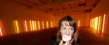
The highlight for me in New York was obviously the galleries. I didn't get to as many as I had planned via my New York Galleries book. I did make it to MOMA, Guggenheim, MET (briefly), Brooklyn Museum, New Contemporary Art Museum, and David Zwirner, as well as a few tiny galleries I don't know the names of. Anyway there's always next time I fly thousands of kilometres around the world to New York. David Zwirner gallery represents some of my favourite artists such as Michael Borremans, Luc Tuymans, Chris Ofili, Alice Neel etc. Anyway I suddenly remembered on one of my last days in New York, that David Zwirner is based in New York, so I looked up the gallery and went. They were having an exhibition of Dan Flavin and other American minimalist artists who came to recognition during the 1960s. other artists represented included; Craig Kauffman, Larry Bell, Peter Alexander, Helen Pashgian. Most of the works were focused on light and the way light or the lack thereof affects the space around it. Had already seen quite a few similar works in galleries like MOCA, however it was nice seeing it all together. And I loved the shiny highly polished exteriors. By far my favourite piece was the extremely beautiful and fluid 'Untitled' by Craig Kauffman. To me this sculpture feels perfect.

Sunday, February 14, 2010

Typewriting

Yesterday I went to the Contemporary art Museum in Barcelona, MACBA. There were two exhibitions on there, Rodney Graham and John Baldessari. All images are Rodney Graham, whose exhibition was really good, I found the John Baldessari exhibition to be kind of trite and uninteresting. Rodney Graham's exhibition "Through the forest" incorporated photography, sculpture and video. I felt like this was the first time I have seen video art that I really loved. This was due to the fact that his videos came across almost like paintings or photographs. They were all very aesthetically beautiful, and there also seemed to be no real feeling of plot or purpose to them. A large amount of repetition, which allows the viewer to look at them satisfactorily for the same amount of time they might look at a painting, and not feel compelled to keep watching and watching. However due to the repetitive nature of the videos and the simplicity of the imagery, they were quite mesmerising, and I found that I preferred to keep viewing them for a much longer period of time than is usual for me with video art.

Sadly I didn't take my camera as my favourite piece in the exhibition was a still life photograph of browned dead flowers in a vase surrounded by blue tinged painting supplies. It is rare that still life works so well without becoming hackneyed. I can't find any pictures of it though and I searched for hours, it was that good. I also went to the Picasso museum while in Barcelona, I didn't find it particularly exciting as I have already seen a lot of Picasso elsewhere, and it seemed like this museum missed out on most of his masterpieces but it was still interesting. However I especially wanted to go after viewing the Rodney Graham exhibition at MACBA, as he also had works on display at the Picasso museum. These works were all playing with the idea of abstraction as seen in an old magazine cartoon about one of Picasso's abstract paintings. I didn't enjoy these works as much as the other exhibition, however they were interesting as they were all dealing with the same theme, using shapes cut out of painted wood attached to a flat plain coloured background. The works were grouped in four different colour pairings on each side of the room, and it was interesting after viewing the Picasso collection, as Picasso often worked on variations of the same painting and theme in multiple paintings. I have also felt like I want to wok in a more 3D way with cut out wood etc after viewing previous exhibitions that highlight this, and this was another interesting take on that format. However quite flat as each work only used two shades of one colour.
Typewriter from MACBA, the gifted amateur here

Glenn Brown in Budapest


While in Budapest I went to the Ludwig Museum of Contemporary Art. Both the Ludwig and the Contemporary Art Museum in Budapest were hosting rival contemporary European video art exhibitions. But I felt that I had seen about as much video art as I could for the time being, so just viewed the Glenn Brown exhibition and the permanent collection at the Ludwig. This made the museum entrance fee kind of a rip off, but I was so confused by the HUF to Australian dollar conversion rate (100 HUF = $0.57AU) that at the time I had no idea how much it cost.
I never really got into Glenn Brown's work, only viewing it briefly in the many Art Now type books in which he is featured, but seeing it in person I have a new appreciation. The painting's surfaces are ridiculously flat and smooth. However, many of his paintings include painted depictions of brush strokes, so it produces kind of a tromp l'oeil effect. This was pretty effective I was often left wondering whether I was actually looking at his paintings, or just prints stuck on canvas. However this did not detract from their interest. They were surprisingly beautiful in the flesh.
The rest of the Ludwig collection was quite nice too, with a bigger emphasis on European artists, and especially painters, which for me is a bonus, however it felt quite small after all the American galleries. WHich was in a way nice not feeling overwhelmed by the volume of work seen, and actually being able to appreciate it and allow it to sink in.

Images from Ludwig Museum, Tate

Search This Blog